
Introduction:
Color is a powerful tool in UX design, capable of influencing emotions, behaviors, and user perceptions. Understanding the psychology behind different colors is essential for designers seeking to create engaging, impactful, and user-centric experiences. In this blog post, we will delve into the fascinating world of color psychology in UX design and explore how you can leverage its power to create visually stunning interfaces that resonate with users on a deep emotional level.
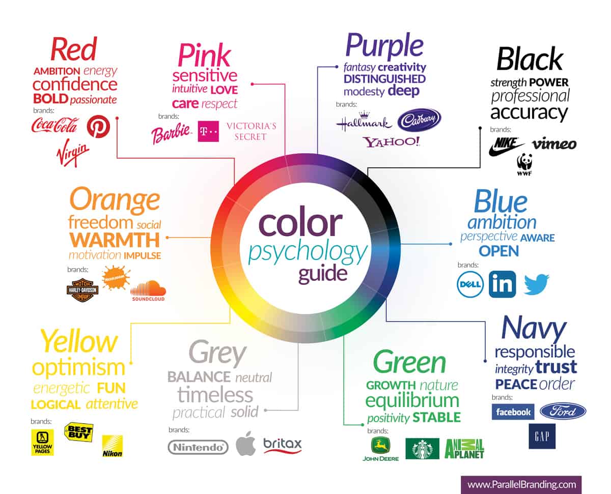
Section 1: Redefining User Experiences with Red, Blue, and Green
Colors like red, blue, and green have distinct psychological associations that can help redefine user experiences. Red, a high-energy color, grabs attention and evokes strong emotions. It can be used strategically to draw attention to important elements such as calls-to-action or alerts. However, excessive use of red can create a sense of alarm or anxiety, so it should be used sparingly.
Blue, on the other hand, is a calming color that instills a sense of trust, security, and reliability. It is often used in corporate or financial websites to convey professionalism and stability. Blue can also be employed in social media platforms or healthcare applications to provide a tranquil and soothing user experience.
Green symbolizes harmony, balance, growth, and freshness. It is commonly used in environmental or health-related websites to create a sense of renewal and well-being. Additionally, green can be effective for financial websites, indicating growth or prosperity.
Section 2: From Yellow to Purple: Eliciting Emotions and Inspiration
Yellow is a bright and cheerful color that exudes happiness, optimism, and attention-grabbing qualities. In UX design, yellow can be used to highlight key elements or encourage action on e-commerce websites or promotional materials. However, it's important to use yellow judiciously as an overload can be overwhelming.
Purple represents creativity, luxury, and sophistication. It can be used in beauty or fashion websites to create an elegant and refined user experience. Purple is also suitable for educational or cultural websites, fostering a sense of creativity and inspiration.
Section 3: Orange: Infusing Energy and Adventure into UX Design
Orange is a color that sparks enthusiasm, determination, and energy. It is often used in sports or fitness websites to create a sense of motivation and excitement. Additionally, orange can be employed in food or travel websites to evoke feelings of adventure and exploration. By leveraging the emotional impact of orange, designers can create immersive experiences that resonate with users.
Using Color Strategically: Considerations for Success
While color psychology provides valuable insights, successful implementation requires careful consideration. Here are some key considerations to keep in mind:
User Preferences: Understand your target audience's preferences and cultural context to ensure the chosen colors resonate with them. Conduct user research and gather feedback to inform your color choices.
Brand Identity: Align the color choices with the brand's personality, values, and messaging to maintain consistency and strengthen brand recognition. Consistency in color usage across different touchpoints helps build a cohesive and recognizable brand identity.
Visual Hierarchy: Use color strategically to guide users' attention by emphasizing important elements through color contrast and saturation. This helps create a clear visual hierarchy and improves usability.
Accessibility: Consider color blindness and other visual impairments when selecting colors to ensure inclusivity and readability. Provide alternative text or visual cues for users who may have difficulties perceiving certain colors.
Context and Purpose: Adapt color choices based on the context and purpose of the design. Different industries and applications may require different color palettes to effectively communicate their message. Consider the emotions and associations evoked by different colors and choose accordingly.
Conclusion:
Color psychology is a powerful tool that can greatly impact the success of UX design. By understanding the psychological associations of different colors and using them strategically, designers can create visually appealing, emotionally resonant, and user-centric interfaces. However, it's crucial to consider user preferences, brand identity, accessibility, and the overall context of the design. With thoughtful and intentional use of color, designers can craft experiences that captivate users, foster positive emotions, and leave a lasting impression.
References:
1. Lidwell, W., Holden, K., & Butler, J. (2010). Universal Principles of Design. Rockport Publishers.
2. Norman, D. A. (2013). The Design of Everyday Things: Revised and Expanded Edition. Basic Books.
3. Preece, J., Rogers, Y., & Sharp, H. (2019). Interaction Design: Beyond Human-Computer Interaction. Wiley.
4. Image: https://www.goldenoakwebdesign.com/wp-content/uploads/exploring-color-psychology-in-design-3.jpg